Overview
This recipe is by Hyosun of Korean Bapsang
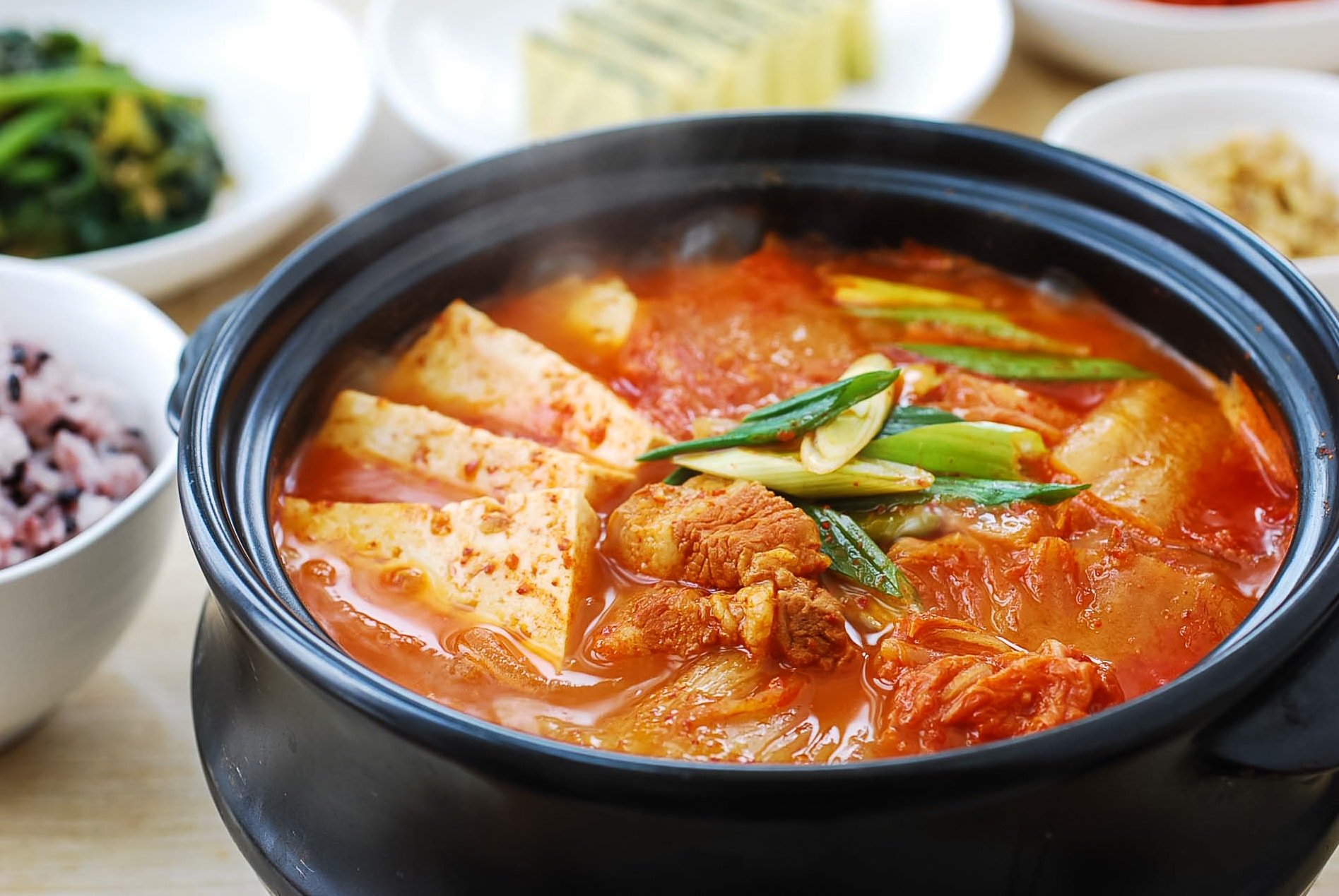
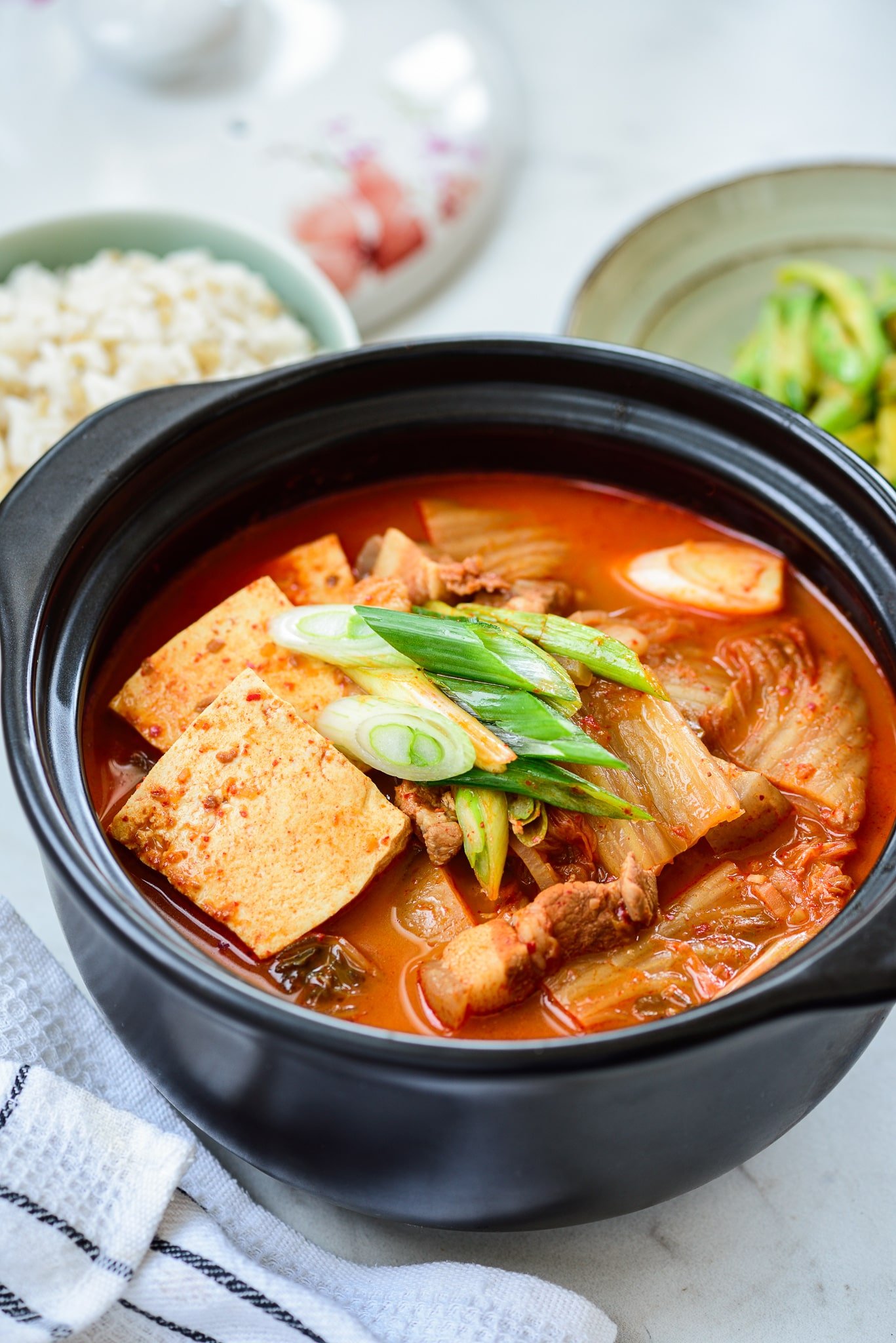
The most common dish made with aged kimchi is kimchi jjigae (김치찌개). It's a go-to stew in Korean homes and my absolute favorite! Whether you make it to use up old kimchi, or to satisfy a craving, this small pot of comfort food is all you need for a satisfying meal.
The Kimchi
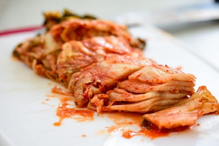
When cooking with kimchi, you should always use fully fermented, sour kimchi. The older the better! If you can’t wait for your kimchi to turn sour, add a little bit of vinegar to the kimchi before using it. It’s not going to be as good as sour kimchi, but it’ll help a little.
Also, your Korean market may carry commercially packaged kimchi called mukeunji (묵은지), meaning old kimchi.
If the kimchi is overly sour to your taste, add a teaspoon or two of sugar to the stew to balance out the sour taste.
The Meat for Kimchi Stew
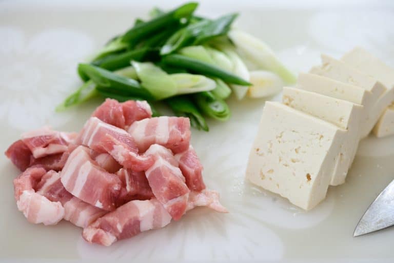
While there are many variations, the most favored protein for kimchi jjigae in Korea is fatty pork. As I always say, kimchi and fatty pork is a match made in heaven. Pork ribs are also common and delicious in kimchi stew. If you want use pork ribs instead, pre-boil the ribs until fairly tender for 20 to 30 minutes, and then cook with kimchi. If you don’t like pork, use beef or canned tuna instead. This recipe also includes the canned tuna version.
Growing up, we also enjoyed kimchi jjigae that was simply made with anchovy broth without any meat. It gives a nice, clean taste to the stew.
Tips for making good kimchi jjigae
- Use old, sour kimchi.
- Cook the kimchi and pork together before adding the liquid. This step develops extra flavor.
- Use the water used to rinse rice (ssalddeumul, 쌀뜨물) as the stew base. It’s commonly used for Korean stews. Use the water from the second or third round of rinsing. The rice water thickens the broth slightly and enhances the flavor.
- Anchovy broth, chicken broth, milky bone broth or vegetable broth will also be great as a soup base.
- Use the juice from the kimchi if available. It will add lots of flavor to the broth.
Instructions
- Cut the kimchi into bite size pieces. Adjust size to preference. (

- Cut the meat into bite sizes. Slice the tofu (about 1/2-inch thick), and roughly chop the scallions.

- Heat a small to medium pot with 1 tablespoon of oil. Add the kimchi, pork, red pepper flakes and garlic and cook over medium high heat until the kimchi is softened and the pork cooks through, about 5 to 7 minutes.

The kimchi should be slightly translucent like in the picture below.

- Add 1/2 cup kimchi juice or 1/2 tablespoon of gochujang and about 2 to 2.5 cups of water (or broth). Bring it to a boil, and continue cooking for 5 minutes.

- Then, reduce the heat to medium, and boil with the lid covering the pot for about 15 minutes. You can add more water if necessary.

- Drop the tofu and scallions in. Salt (or soup or regular soy sauce) and pepper to taste. (Salt is usually not necessary, unless kimchi was lightly seasoned or kimchi juice is not available.) Boil until the tofu is cooked through, about 5 minutes.

- Serve while bubbling over from the heat.

Tuna or salmon kimchi jjigae
To make kimchi jjigae with tuna instead, follow the same steps leaving out the pork. Add one can of tuna with oil when adding the kimchi juice and water and boil for 10 - 15 minutes. (You can add onion slices at this point if desired.) Follow the rest of the recipe above. (Fresh or canned salmon works well too in kimchi jjigae.)
Leftovers
If you have any leftovers, store the remaining stew in a soup container and place in the fridge. Eat within three to four days. Source
Recipe Websites
- The Woks of Life
This website has clear instructions coupled with the corresponding image right under each step. A feature of this website in particular that stands out to me is the inclusion of links to other helpful websites for items within the ingredients list. For example, if the recipe calls for "chicken stock" then clicking that phrase in the ingredients list will direct you to a page that explains exactly what it is and how to make it yourself.
- Food Network
This website has a clear and simple organization for its recipes: short overview, ingredients list, tools list, and explanatory video. By keeping the recipe elements concise, the website does a good job of getting straight to the point without confusing any of its users.
- Delish
This website has the yield, prep time, total time very clearly stated within boxes with bolded numbers, which I would find useful in quickly determining whether or not a certain recipe is doable with the time I have and/or yields the amount of servings that I need. It also starts its recipes with Q&As that give useful information such as possible subsitutes and vegan-friendly alternatives.
Non-recipe Websites
- WikiHow
While many people believe this website contains questionable content, to which I'd agree, I do think that the way the tutorials are formatted exemplify good communication through design. The tutorials start with a quick overview, and then the steps are clearly laid out with numbers and illustrations. The steps also include advice in bullet points. These features would work well in a recipe website that needs to communicate a step-by-step process.
- Glossier
The Glossier website is clean and follows and nice grid that makes it easy to navigate. The photos used in the website also help the users immediately understand what the products are because there is nothing outside of the subject of the image other than a light gray background. The clean and minimal design encourages me to not go overboard with the elements within my own website.
- Ok Alpha
The parallax scrolling in this webiste is done very nicely. The transitions are smooth and not overly complicated. While I am not sure if I will be able to implement this level of interaction within my own website without making it confusing, I think that Ok Alpha provides a good example of this type of interactive scrolling in a noticable but not overwhelming way.
